Designing Your User Experience Strategy, Part 3 (The Creative Process)
/by Tracey Greene
Digital Artisans is KGL PubFactory’s lead design partner. In this three-part blog post series, Tracey shares valuable insights into maximizing discoverability and accessibility when creating your digital content platform.
Part 3: The Creative Process
When designing your publishing platform, there are many factors to consider to deliver an optimal user experience. It’s critical to establish a user-first driven process, as diagrammed below.
As discussed in parts 1 and 2, it is imperative that your web publishing platform be designed with accessibility, responsiveness, and consistency for all users and devices. Publisher websites are often built using templates and components to help present content in a familiar pattern that users recognize and can easily access. But when designing the “skin” for these experiences, maintain your stylistic uniqueness to strengthen your brand presence. Your brand’s attributes and voice must be visually communicated.
Three essential resources during the “skin” design are:
Brand and/or Style Guide, describing:
How your brand should look and feel
Logo requirements
Typography usage
Rules and standards for image use
Color treatment requirements. It is important to ensure that all colors pass the color contrast accessibility test. If your brand’s color palette does not pass, then determining how to evolve is a necessary part of the process. The design team will experiment with and refine the color palette as necessary.
And much more.
Design System to define and provide an outline of your platform components. You should think of the platform components as the building blocks to construct your web pages, e.g. various type boxes, table insertions, image placeholders, and more. Additionally, you can add other web-specific items like videos, expand/collapse containers, figures viewers, content enrichment tools, related content blocks, and more.
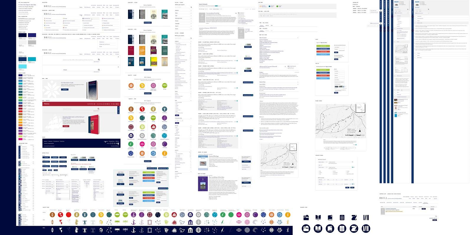
NOTE: During the discovery phase of your web platform project, it is important to identify the components needed to communicate the content effectively and to provide users with an optimal experience. The primary objective of the design system is to provide you with flexibility. See example: Google’s Material DesignPattern Library presents a set of all design elements, broken down to a granular level. It acts as a link between both the Brand/Style Guide requirements and the platform’s Design System. It will help you visualize all of the elements within the platform and allow you to provide design feedback with a holistic view. Pattern libraries document fonts and colors in addition to outlining UI elements like buttons, forms, icons, cards, toolbars, and menus.
This wraps up my three-part blog post series in “Designing your User Experience Strategy”. I hope you have found these posts to be helpful! Speaking of which, here are some helpful links from me to you:
WebAIM’s Color Contrast Checker – my favorite tool
WebAIM’s WAVE – web accessibility evaluation tool
This concludes Part 3: The Creative Process. Click here to read Part 1: Resolution Matters. Click here read Part 2: Accessibility Improves Experience.


